Detective Conan Wiki:Manual of Style/Profile pictures
- Back to the Manual of Style
This page is a picture guide on how to select excellent profile pictures. Profile pictures have been a hotspot for edit wars. Fights over profile pictures are best avoided by not uploading pictures that are lack the necessary qualities described below.
Sometimes profile images with one or more of the flaws listed below will be used, sometimes because there is no better image, or because an image is still good despite having flaws. This guide is meant to be instructive, not a cut-in-stone ruleset that can't be violated.
Contents
- 1 Profile pictures should use the standard name and image format
- 2 The image has proper proportions
- 3 The image shows all of the character's most distinguishing features
- 4 Profile pictures should be the best quality of animation
- 5 The image is of good quality
- 6 The image does not have noticeable watermarks or borders
- 7 Images should not be especially dark or unusually lit
- 8 Profile pictures should have "normal" expressions
- 9 Images should match the character's current appearance
- 10 Profile pictures should be from between 3/4s turned and straight on
- 11 Profile pictures should be looking toward the reader or close to that
- 12 Profile pictures should not have busy or distracting backgrounds
- 13 Profile pictures should not be especially idiosyncratic
Profile pictures should use the standard name and image format
Using the standard image name lets other users keep track of past versions of the profile, avoids orphaning files, and streamlines actions involving large numbers of profile images down the line. 99% of the time, the page name and the profile name will be the same.
- The standard name is (Given Name)_(Family Name)_Profile.jpg
The image has proper proportions
Profile pictures should have proper proportions. Train yourself to notice images that gave been stretched or distorted and always check images before you upload them, especially if you use a screenshotting program.
The image shows all of the character's most distinguishing features
Any animated character, especially those in Detective Conan, has distinguishing facial features and hairstyles. An excellent profile picture captures all of these in as close to their entirety as possible. Consider the below images of Hattori Heiji.
File:Heiji Hattori Profile1.jpg This image is further from Hattori's face so his hair point and hat are both in the frame |
Hattori's face's most distinctive traits are his dark skin, blue green eyes, horizontal hairpoint, and distinctive ballcap. The image on the left captures all of those within the frame, versus the second which has cut out the hat and hair. The one on the left is thus a better profile image.
Profile pictures should be the best quality of animation
Aoyama Gosho and the animators vary the quality of images from frame to frame depending on how important the scene is or whether they are using a model. Only select images from the highest quality frames.
 The animators did not to that great of a job on this Sera from Episode 647 |
 This frame of Sera from Episode 648 is also lousy |
The image is of good quality
Profile pictures should be of good quality. Images should be relatively large so that they are shrunken, not enlarged, when automatically resized for the profile template. While jpeg images are not compressed particularly well on wiki software and thus tend to be grainy no matter what, it is best that the images be taken on the highest resolution anyway so as not to increase the magnitude of the problem, and so they look nice to anyone who decides to view the image at the largest size.
The image does not have noticeable watermarks or borders
Profile images with no watermarks or the watermarks edited out are the most preferable. Watermarks from Japanese TV stations are generally accepted because they are small and unintrusive. Images with watermarks from anime upload sites or fansubbing groups are strongly frowned upon and should not be uploaded at all if possible.
- Images uploaded from the manga should have the borders cropped out as much as possible.
- Text bubbles should be cropped out as much as possible and the text in them erased UNLESS the text makes the picture more useful (e.g. used to illustrate a conversation or specific scene).
Images should not be especially dark or unusually lit
Dark images do not show up well on dim monitors, and it is common for laptop screens to not be on the brightest setting in order to conserve batteries.
Profile pictures where the character is in excessive shadow are undesirable.
Unusually colored lighting distorts the character's appearance. Either use a program to re-balance the color or find a more suitable image.
Profile pictures should have "normal" expressions
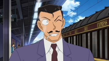
Profile images should have whatever expression is most common or characteristic of that character, or else a neutral to slightly happy expression. Strange or "Gag" expressions are distracting and are not typical for the character.
Images should match the character's current appearance
Please use images that match the current art style if possible.
- People often go the most overboard on this and upload lower quality images simply because they are newer, without any other redeeming features. Unless the character has changed style or appearance significantly, old images are perfectly fine.
Profile pictures should be from between 3/4s turned and straight on
The face of the characters should be mostly turned forward in order to show most of the face.
Profile pictures should be looking toward the reader or close to that
It is distracting and disconnecting when a person in a profile image is looking nowhere near outward.
Profile pictures should not have busy or distracting backgrounds
It is easier on the eyes when background detail is kept to a minimum so that it doesn't interfere with the character in the foreground.
Profile pictures should not be especially idiosyncratic
Sort of a catch all category, but there are many images that are just off for one reason or another. Non-typical appearance, off-centered image, unusual outfits, strange things in the background, and odd looking art may make reduce the value of a profile picture.
